
![]()
An all-in-one payment app for everyday Ghanaians
Overview
360Pay is a mobile payment platform designed to consolidate the fragmented financial tasks people complete every day sending money, paying electricity bills, buying airtime, booking travel into a single, trusted app. I was brought on as the solo Brand and UX UI Designer, responsible for the product’s identity, visual language and interface design from the ground up.
The challenge was not to invent new behaviours. It was to make familiar tasks feel dramatically faster, cleaner, and more trustworthy than any existing option in the market.
Case Study
Time Frame: April 2024 – Dec 2025
Role: Product Designer (end-to-end) + UX UI Designer
Deliverables: UX Research, UI Design, Prototyping
Platform: Mobile (iOS & Android)
Scope: Concept to Launch
Status: Live
Discovery & Research
Listening before
designing.
Before opening Figma, I ran user interviews and a detailed competitor analysis across the most widely used payment apps in Ghana. The goal was to understand what users actually experienced, not what product teams assumed they experienced.
“I sometimes give up halfway through. Too many screens just to send someone money.”
Three pain points surfaced consistently across interviews:
01
Too many steps
Users described abandoning transactions midway due to multi-screen flows that felt disconnected and exhausting for simple tasks.
02
Confusing navigation
Features were buried in menus with inconsistent labels. Users couldn’t find the action they needed without hunting through the app.
03
Unreliable performance
Slow loading and unclear feedback on transaction status left users anxious about whether payments had gone through at all.
The competitor analysis reinforced this. Most apps were feature-rich but interface-poor, they would accumulated functionality over time without ever going back to simplify the experience. This was 360Pay’s opportunity: not more features, but a fundamentally cleaner way to access them.
The Central Design Decision
One screen.
One action.
At a time.
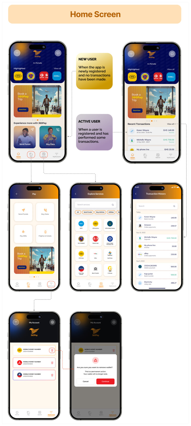
The most consequential decision on this project was also the most counterintuitive: a payment app with five major feature areas should have a minimal home screen, not a feature-packed dashboard.
The Temptation
Surface everything on the home screen. Show the balance, quick-send, recent contacts, bill shortcuts, airtime buttons, promotions, all at once. This is what most apps do. It signals capability.
The Design
Show the balance clearly. Group all actions into four clean, labelled icons. Let each task own its own screen completely once selected. The home screen becomes a calm starting point, not a cluttered launchpad.
The principle behind this decision was that trust is built through clarity, not completeness. A user who can instantly find what they’re looking for and complete it in three taps will trust the app far more than one who can see everything but is overwhelmed by where to start.
Trust is built through clarity, not completeness. Showing less, done well, outperforms showing everything.
Design Principles that guided every screen
01
Reduce cognitive load at the moment of action
Each task flow was stripped to its minimum viable steps. Sending money requires the recipient, amount, and confirmation, nothing else. Every screen was reviewed with the question: does this element help the user complete this task right now?
02
Make system status visible and instant
Addressing the unreliable performance frustration directly, every transaction triggers an immediate, unambiguous status screen, success, pending, or failed, with clear next steps. No ambiguity.
03
Brand as a trust signal, not just an aesthetic
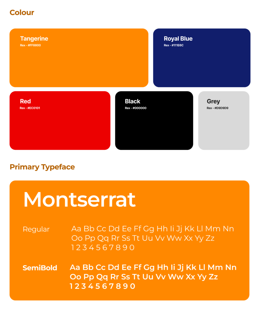
As the brand designer, I chose a deep navy palette and structured typography to signal security and stability. In a market where many payment apps use playful, consumer-brand aesthetics, 360Pay’s composed visual identity was itself a statement of credibility.
Outcome
The app launched and is live.
360Pay shipped as a live product. The end-to-end delivery, brand system, UI design, and interaction patterns was completed from concept to launch, with the complete visual identity and interface ready for development handoff.

Designing both the brand and the product interface gave me an unusual ability to make them reinforce each other, the same principles of clarity and confidence run through the logo, the palette, and every screen.
This project demonstrated something I have found consistently true in fintech design: the visual brand and the product UX cannot be designed in isolation. Users experience them as one thing. 360Pay’s identity and its interface speak the same language, that coherence is what makes the app feel trustworthy before a single transaction is made.